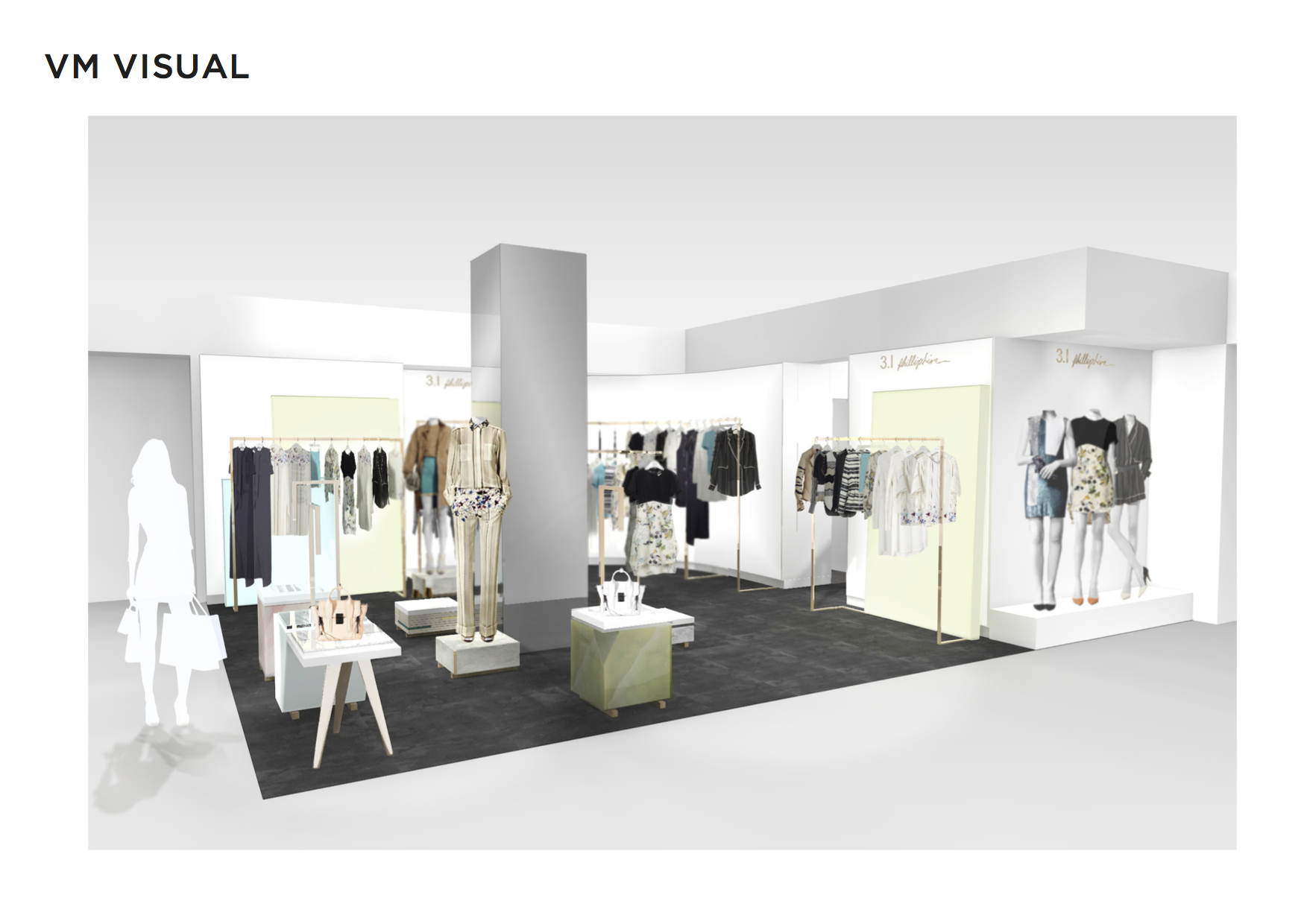
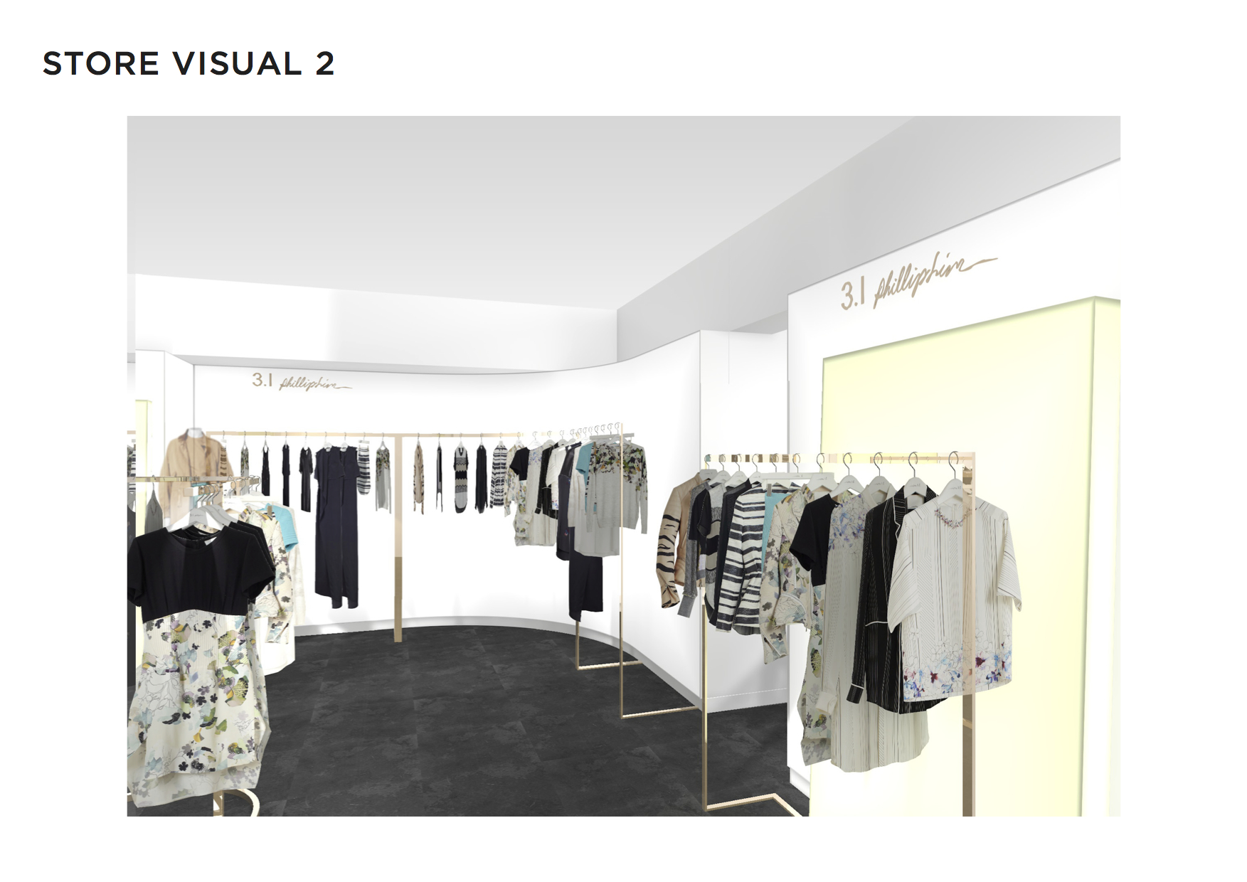
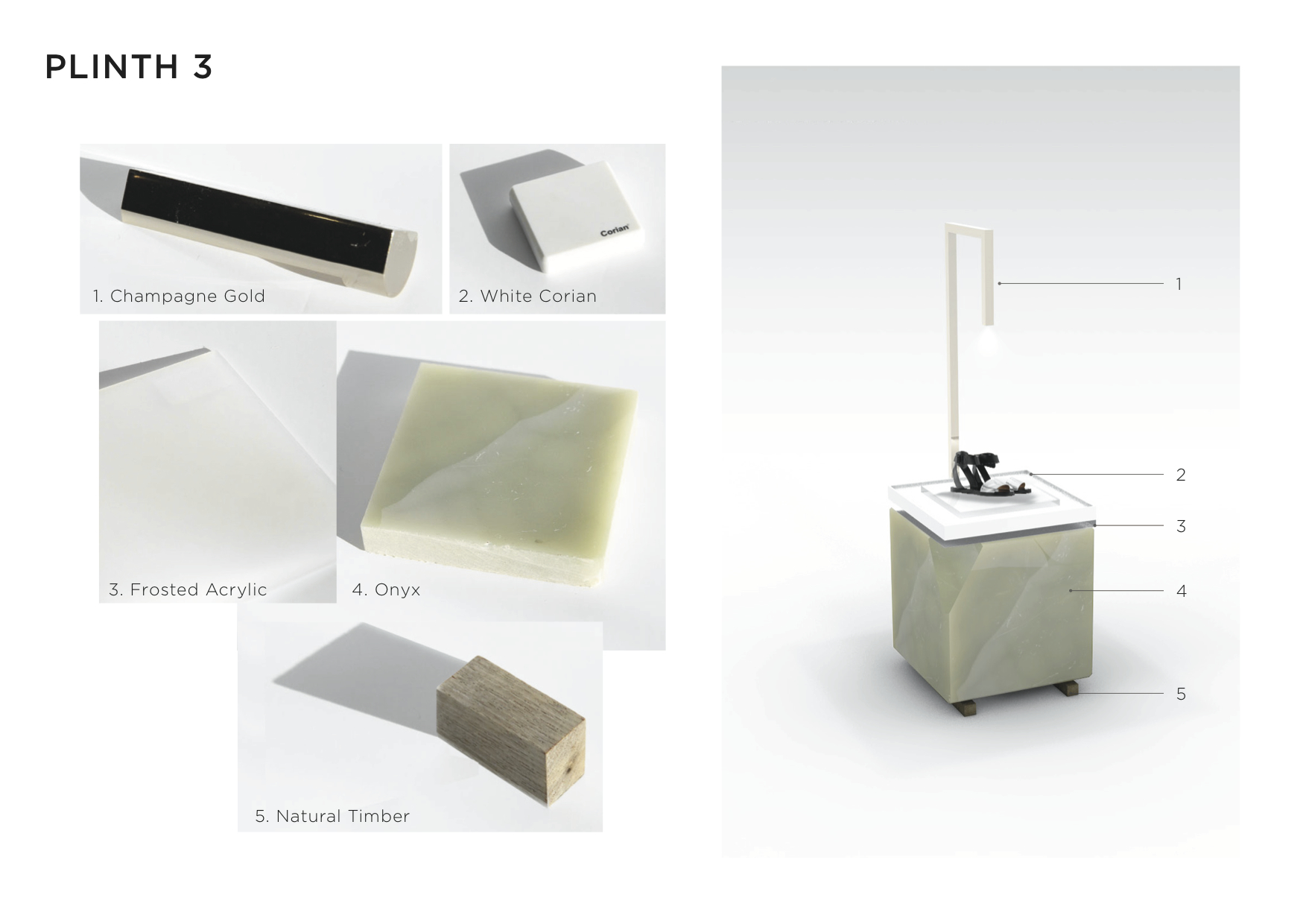
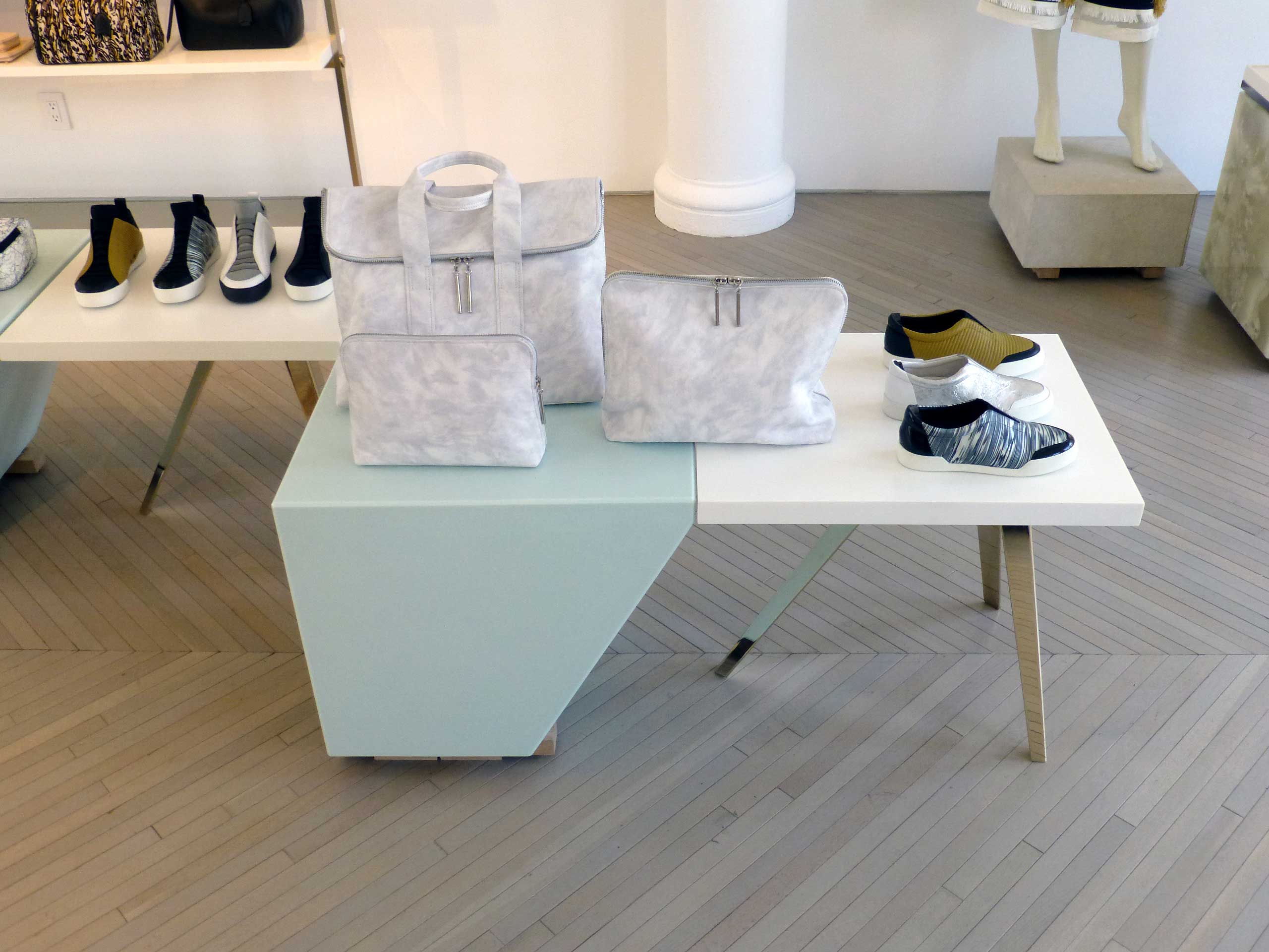
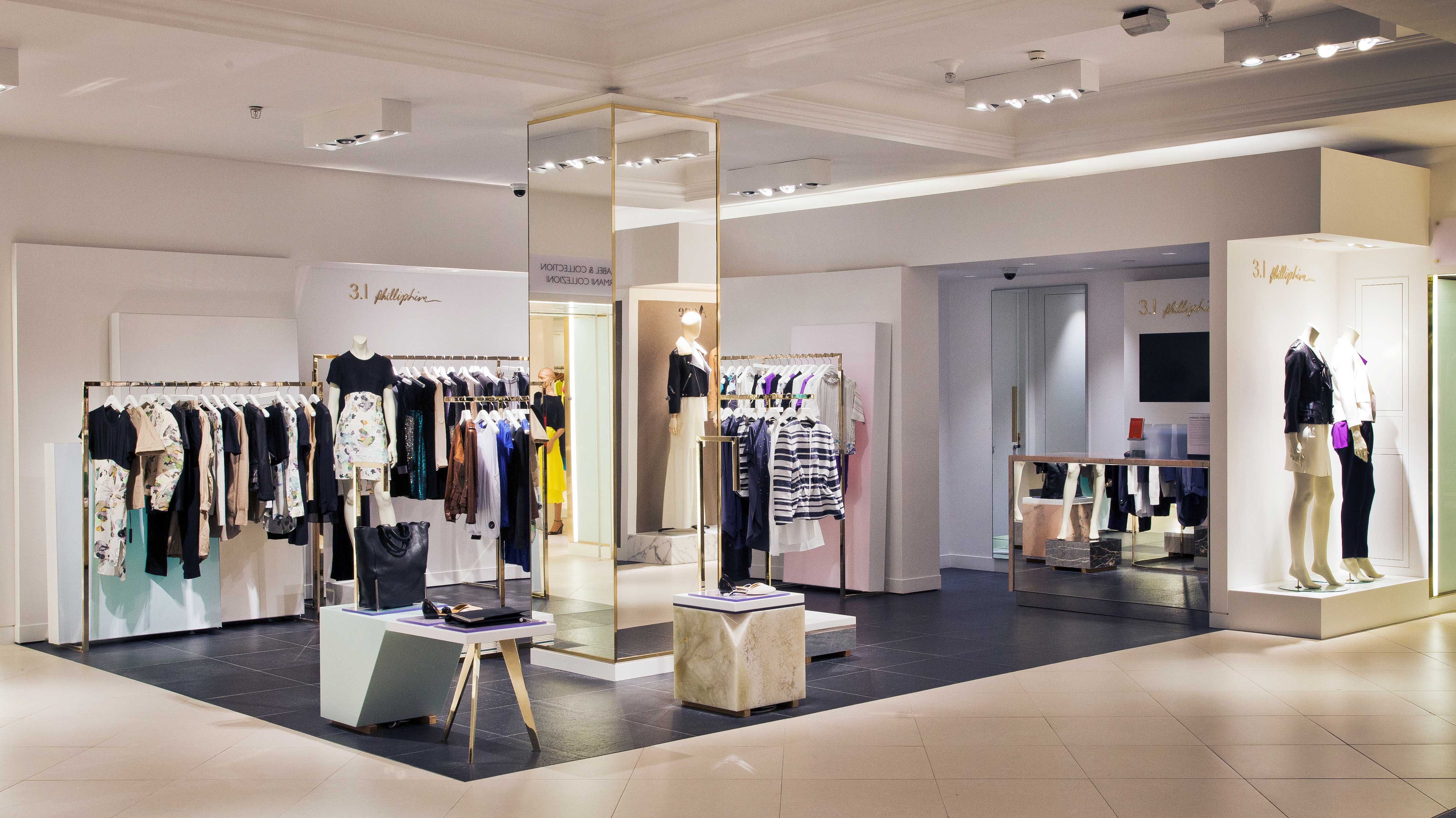
The task was to create a dynamic, effortless solution that reflects the 3.1 Phillip Lim brand narrative. To quote Phillip Lim as a ‘play between two seemingly opposing ideas’. We mixed ‘luxurious & pragmatic’ materials in various ways. Created a floor of classic madness, as the Architectural feature of the space, this combines heritage patterns with unexpected materials.
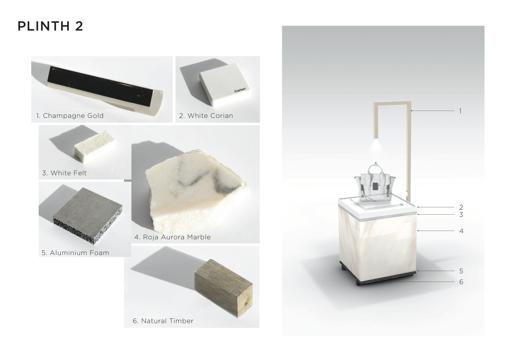
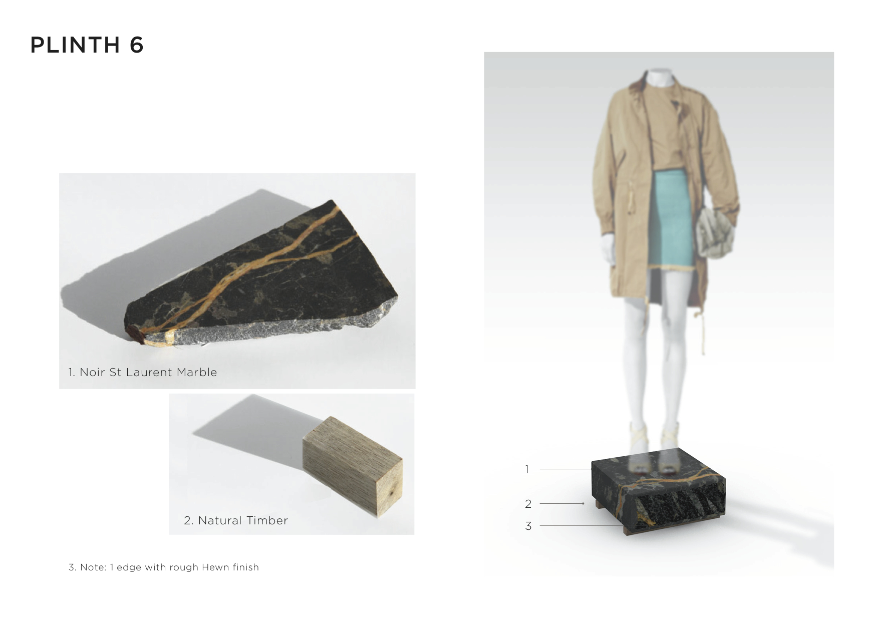
The fashion is the feature of the space displayed on ‘Workshop Plinths’ and ‘Studio Canvases’. That casual mix of raw Materials, Luxurious marble slabs with layers of multiple felt and white-washed plywood, concrete, and slight, unexpected hints of precious materials, in a design that is ‘Youthful and Elegant’.

